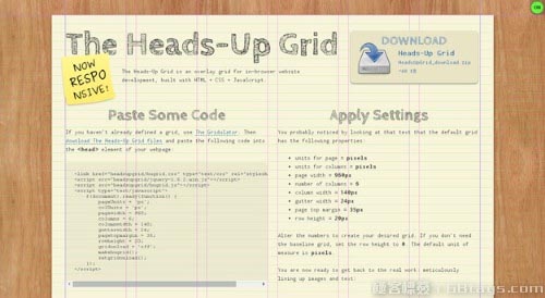
Headsup Grid的特点是它可以在不同的平台上显示出不同的风格。
也可以让你的HTML可以像PS那样显示辅助线效果!

在其右上角有一个ON/OFF的按钮可以开启关闭辅助线
使用方式很简单,示例代码如下
<!doctype html>
<html>
<head>
<meta charset="utf-8" />
<meta name="viewport" content="width=device-width, minimum-scale=1.0, maximum-scale=1.0" />
<title>The Heads-Up Grid</title>

<link href="headsupgrid/hugrid.css" type="text/css" rel="stylesheet" />
<script src="headsupgrid/jquery-1.6.2.min.js"></script>
<script src="headsupgrid/hugrid.js"></script>
   /**方式1:响应式代码**/
   /* $(document).ready(function() {
        pageUnits = 'px';
        colUnits = 'px';
        pagewidth = 960;
        columns = 6;
        columnwidth = 140;
        gutterwidth = 24;
        pagetopmargin = 35;
        rowheight = 20;
        gridonload = 'off';
        makehugrid();
        setgridonload();
    });
    */

    /**方式2:响应式代码**/
    definegrid = function() {
        var browserWidth = $(window).width();
        if (browserWidth >= 1001) {
            pageUnits = 'px';
            colUnits = 'px';
            pagewidth = 960;
            columns = 6;
            columnwidth = 140;
            gutterwidth = 24;
            pagetopmargin = 35;
            rowheight = 20;
            gridonload = 'on';
            makehugrid();
        }
        if (browserWidth <= 1000) {
            pageUnits = '%';
            colUnits = '%';
            pagewidth = 94;
            columns = 2;
            columnwidth = 48;
            gutterwidth = 4;
            pagetopmargin = 35;
            rowheight = 20;
            gridonload = 'on';
            makehugrid();
        }
        if (browserWidth <= 768) {
            pageUnits = '%';
            colUnits = '%';
            pagewidth = 96;
            columns = 2;
            columnwidth = 49;
            gutterwidth = 2;
            pagetopmargin = 35;
            rowheight = 20;
            gridonload = 'on';
            makehugrid();
        }
    }
    $(document).ready(function() {
        definegrid();
        setgridonload();
    });

    $(window).resize(function() {
        definegrid();
        setgridonresize();
    });
</script>

</head>

<body>
    <div>
        <p>Headsup Grid的特点是它可以在不同的平台上显示出不同的风格。</p>
    </div>
    <div>
        <p>
         Luckily, the way that I originally constructed the Heads-Up Grid made it relatively easy to adapt to the needs of responsive web design. You can quickly and easily define as many different grids as you need by way of basic JavaScript conditional statements. Even if you are not extremely comfortable with JavaScript, if you are ambitious enough to tackle responsive web design you will most likely have no problem figuring this out.</p>
    </div>
    <div>
        <p>
        To create a responsive grid use the following code as a template. This template is fairly self-explanatory if you are familiar with CSS Media Queries. These JavaScript conditional properties should directly match the properties you are using for your media queries. Then simply define the properties of multiple grids in the same way you would define a single grid above.</p>
    </div>
    <div>
        <p>
        The result should be a system that checks the browser window width on pageload as well as any time that the browser window is resized and render the appropriate grid.</p>
    </div>
</body>
</html>


