Velocity.js是一款jquery动画引擎插件,它拥有与jquery中的$.animate()相同的API,还打包了颜色动画,转换,循环,easing效果,类动画、滚动等功能,因此大家可以像使用$.animate()方法一样使用velocity,您可以快速的上手velocity.js。简单点说:Velocity就是实现页面元素中的飞入,飞出,旋转、颜色变换,esaing效果的jquery动画插件。
jquery实例:Velocity动画插件的使用方法
引入核心文件
<script src="http://libs.useso.com/js/jquery/1.11.1/jquery.min.js"></script>
<script src="velocity.min.js" id="library"></script>
写入html
<div id="welcome">
    <p id="browserWidthNotice">
        嘿嘿,jQ酷整理
    </p>
    <p>
        没有 WebGL. 没有 Canvas. 仅仅操作了 DOM.
    </p>
    <p>
        <span id="count">175个</span> 圆角带阴影的div
    </p>
</div>
<a id="logo" href="index.html">Velocity<span id="logoDot">.</span>js</a>
<div id="container"></div>
写入CSS,此处的CSS可根椐自己的需求定义,还有不了解CSS3的朋友,请先学习下CSS3,在这就不一一的解释了
* {
padding: 0;
margin: 0;
pointer-events: none;
}
body {
background: #060b14;
overflow: hidden;
font-family: "Helvetica Neue", "Open Sans";
font-weight: 100;
}
a {
color: #4bc2f1;
text-decoration: none;
}
a:hover {
text-decoration: underline;
}
#container {
perspective: 50px;
-webkit-perspective: 50px;
-moz-perspective: 50px;
-ms-perspective: 50px;
transform-origin: 50% 100%;
-webkit-transform-origin: 50% 100%;
-moz-transform-origin: 50% 100%;
-ms-transform-origin: 50% 100%;
opacity: 0.55;
}
#welcome {
position: fixed;
width: 22rem;
left: 50%;
top: 45%;
margin-top: -1rem;
margin-left: -11rem;
font-weight: 200;
color: #fff;
opacity: 0.65;
text-align: center;
font-size: 0.775rem;
line-height: 1.05rem;
letter-spacing: 0.135em;
word-spacing: -0.075rem;
}
@media screen and (max-width: 400px) {
#welcome {
font-size: 0.45rem !important;
}
}
#browserWidthNotice {
font-style: italic;
display: none;
}
#logo {
position: fixed;
right: 0.75rem;
bottom: 0.65rem;
cursor: pointer;
text-decoration: none;
color: #d6d6d6;
font-size: 2rem;
letter-spacing: 0.025em;
}
#logoDot {
color: #d74580;
}
.dot {
position: fixed;
width: 30px;
height: 30px;
border-radius: 30px;
background-color: #4bc2f1;
}
写入JS,实现效果
/*****************
Summary
*****************/
/* Watch the codecast to learn how this demo was made: https://www.youtube.com/watch?v=MDLiVB6g2NY&hd=1 */
/* This demo serves two purposes:
1) Act as Velocity's primary visual test (in addition to the unit and load tests).
2) Demonstrate all of Velocity's features.
3) Demonstrate the performance capabilties of the DOM; WebGL and Canvas are not used in this demo.
*/
/* Intended demo behavior:
1) A message box fades out.
2) Dots are randomly assigned coordinates and opacities then translated and increased in opacity. This animation is then reversed.
3) Meanwhile, the dots' container has its perspective, rotateZ, and opacity animated in a loop with a delay.
4) Once the dot animation is complete, the message box fades back in.
*/
/*********************
设备类型
*********************/
var isWebkit = /Webkit/i.test(navigator.userAgent),
isChrome = /Chrome/i.test(navigator.userAgent),
isMobile = !!("ontouchstart" in window),
isAndroid = /Android/i.test(navigator.userAgent),
isIE = document.documentMode;
/******************
重定向
******************/
if (isMobile && isAndroid && !isChrome) {
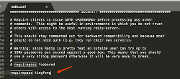
alert("虽然 Velocity.js 可在所有的手机浏览器上使用, 但本3D实例只在IOS和安卓系统上的谷歌浏览器运行,确定后返回jQ酷首页");
window.location = "http://www.jqcool.net";
}
/***************
Helpers
***************/
/* 取得两个整数间的随机数 */
function r (min, max) {
return Math.floor(Math.random() * (max - min + 1)) + min;
}
/* 重写essing的默认类型. */
$.Velocity.defaults.easing = "easeInOutsine";
/*******************
创建圆点
*******************/
/* Differentiate dot counts based on roughly-guestimated device and browser capabilities.
基于设备和浏览器创建不同的圆点
*/
var dotsCount,
dotsHtml = "",
$count = $("#count"),
$dots;
if (window.location.hash) {
dotsCount = window.location.hash.slice(1);
} else {
dotsCount = isMobile ? (isAndroid ? 40 : 60) : (isChrome ? 175 : 125);
}
for (var i = 0; i < dotsCount; i++) {
dotsHtml += "<div class='dot'></div>";
}
$dots = $(dotsHtml);
$count.html(dotsCount);
/*************
Setup
*************/
var $container = $("#container"),
$browserWidthNotice = $("#browserWidthNotice"),
$welcome = $("#welcome");
var screenWidth = window.screen.availWidth,
screenHeight = window.screen.availHeight,
chromeHeight = screenHeight - (document.documentElement.clientHeight || screenHeight);
var translateZMin = -725,
translateZMax = 600;
var containerAnimationMap = {
perspective: [ 215, 50 ],
opacity: [ 0.90, 0.55 ]
};
/* IE10+ produce odd glitching issues when you rotateZ on a parent element subjected to 3D transforms.
当在一个父级元素使用3D变型旋转Z轴时IE10+会出现莫名的错误
*/
if (!isIE) {
containerAnimationMap.rotateZ = [ 5, 0 ];
}
/* Ensure the user is full-screened; this demo's translations are relative to screen width, not window width.
确保用户使用的是全屏;本实例变形相对于整个屏幕,而不是窗口;
*/
if ((document.documentElement.clientWidth / screenWidth) < 0.80) {
$browserWidthNotice.show();
}
/*****************
Animation
*****************/
/* Fade out the welcome message.
淡淡显示欢迎信息
*/
$welcome.velocity({ opacity: [ 0, 0.65 ] }, { display: "none", delay: 3500, duration: 1100 });
/* Animate the dots' container.
动画出现圆点的容器
*/
$container
.css("perspective-origin", screenWidth/2 + "px " + ((screenHeight * 0.45) - chromeHeight) + "px")
.velocity(containerAnimationMap, { duration: 800, loop: 1, delay: 3250 });
/* Special visual enhancement for WebKit browsers, which are faster at box-shadow manipulation.
特别改善webkit浏览器的视觉效果,因为阴影得到更快的控制
*/
if (isWebkit) {
$dots.css("boxShadow", "0px 0px 4px 0px #4bc2f1");
}
/* Animate the dots.
圆点动画
*/
$dots.velocity({
translateX: [
function() { return "+=" + r(-screenWidth/2.5, screenWidth/2.5) },
function() { return r(0, screenWidth) }
],
translateY: [
function() { return "+=" + r(-screenHeight/2.75, screenHeight/2.75) },
function() { return r(0, screenHeight) }
],
translateZ: [
function() { return "+=" + r(translateZMin, translateZMax) },
function() { return r(translateZMin, translateZMax) }
],
opacity: [
function() { return Math.random() },
function() { return Math.random() + 0.1 }
]
}, { duration: 6000 })
.velocity("reverse", { easing: "easeOutQuad" })
.velocity({ opacity: 0 }, { duration: 2000, complete: function() {
$welcome
.html("<a href='http://www.jqcool.net'>返回jQ酷首页.</a>")
.velocity({ opacity: 0.75 }, { duration: 3500, display: "block" })
.find("*").add($welcome).css("pointer-events", "auto");
}
}) .appendTo($container);
以上就是一个完整的实例代码了,因为是个相对综合的例子,所有点复杂。下面来看下velocity的选项吧,简单实用点,嘻嘻。
参数
velocity可以传两个参数,第一个可以像css参数一样传输属性和值,而对象的选项则可以通过第二个参数传递,代码如下:
$element.velocity({
    width: "500px",
    property2: value2
}, {
    /* Velocity's default options */
    duration: 400,
    easing: "swing",
    queue: "",
    begin: undefined,
    progress: undefined,
    complete: undefined,
    display: undefined,
    visibility: undefined,
    loop: false,
    delay: false,
    mobileHA: true
});
单一对象
Velocity支持单一个参数模式
$element.velocity({
    properties: { opacity: 1 },
    options: { duration: 500 }
});
//或者
$element.velocity({
    p: { opacity: 1 },
    o: { duration: 500 }
});
逗号分隔
代替对象选项的参数输入,还可以使用像jquery中的逗号分隔模式,但仅限于duration, easing, andcomplete属性;代码如下
$element.velocity({ top: 50 }, 1000);
$element.velocity({ top: 50 }, 1000, "swing");
$element.velocity({ top: 50 }, "swing");
$element.velocity({ top: 50 }, 1000, function() { alert("Hi"); });